
Great design does not simply make an old story look new. It creates a new entry point without flattening what made the story meaningful in the first place. That is what makes the renewed life of One Hundred Years of Solitude in Japan so interesting to me—as a Colombian and as a designer.
Gabriel García Márquez’s Macondo is intensely specific: Colombian history, family mythology, violence, humour, heat, memory, politics, superstition, and the ordinary coexist with the impossible. Yet the novel has travelled remarkably well across languages and generations.
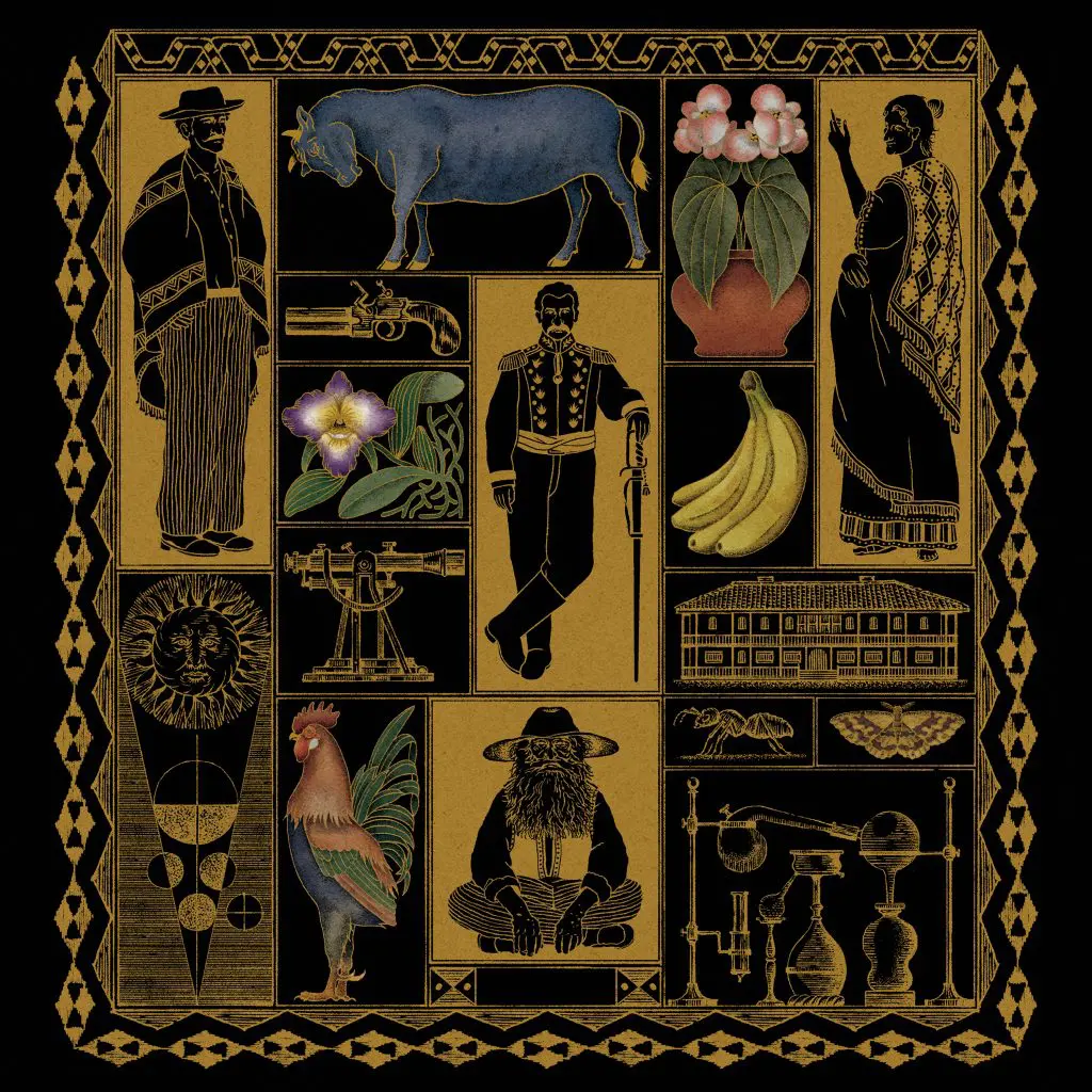
The Japanese edition illustrated by Ryuto Miyake offers a useful design lesson. Rather than reducing Macondo to a generic Latin American aesthetic, the cover creates a dense visual world that invites inspection. It functions almost like an information system: characters, objects, flora, fauna, and symbols become clues into a narrative a new reader has not yet entered.

Product designers deal with translation constantly, even when we are not localizing a product. Research has to become requirements. Business rules become interactions. Technical constraints become understandable behaviour. A design system turns organizational decisions into reusable patterns.
The difficult part is preserving meaning while changing form. Miyake’s work is compelling because the visual language feels distinct without pretending the source material belongs somewhere else.
That is a useful standard for any design system: adapt to context without erasing identity.
It is tempting to talk about magical realism through colour, surreal imagery, or “magic moments.” But what makes García Márquez’s world powerful is not decoration. It is the consistency of its internal logic.
Extraordinary events are presented with the same confidence as ordinary ones. Family histories repeat. Names recur. Time folds back on itself. The reader gradually learns how this world behaves.
That is surprisingly close to what makes a product experience coherent. Users learn systems through repeated rules. Delight works when it belongs to those rules, not when it is pasted onto the interface.
The Netflix adaptation introduced Macondo through yet another medium. Literature can leave an image unresolved in the reader’s mind; television has to make choices about architecture, casting, landscape, costume, pacing, sound, and the physical reality of the world.
Every one of those choices converts ambiguity into implementation.
Product teams face the same tension when a concept moves from strategy to prototype to production. Each step makes the idea more concrete—and each step can accidentally lose something important. Strong creative direction is partly the discipline of knowing which qualities must survive that translation.

The Japanese cover and the screen adaptation do not replace the novel. They lower the distance between an unfamiliar audience and the original work. That distinction matters.
Good onboarding does something similar. It does not expose every rule at once or simplify the product until nothing meaningful remains. It gives people enough orientation to enter a complex system confidently and discover more as they move through it.
I have spent much of my career designing digital systems in Canada, but I still recognize Colombia immediately in García Márquez’s world—not as a postcard, but as a particular way memory, contradiction, humour, beauty, and history can coexist.
Seeing Macondo interpreted through Japanese illustration and global television is a reminder that design can carry something deeply local across enormous cultural distance without making it generic.
That may be the more useful definition of universal design: not making everything look the same, but creating enough clarity and care that something specific can travel without losing its soul.

